Here’s the thing about Google’s new logo: it’s not about the logo
The update to the search giant’s logo is more than a simple rebranding; it reflects the shifting contexts digital platforms are increasingly occupying.
Nobody likes change. Or so we’re told. It’s a fair bet that the very powerful human desires for familiarity and comfort have been bred into our DNA through millennia of evolution, making us particularly resistant to change, a condition known as ‘status quo bias’ in psychology. The end of a relationship, moving homes, or even the sadly unpreventable act of ageing are all changes that we deal with notoriously poorly.
But, frankly, we don’t fare much better with relative trivia; just look at the response whenever Facebook redesigns its interface, or a football club tweaks its crest. Sometimes these concerns are addressed, but usually—inevitably—the changes are absorbed, and we look back and laugh at the way things used to be.
In fact, when change is extremely gradual, we don’t even notice at all — when eBay shifted its background colour from yellow to white, it was flooded with complaints, and was forced to rescind the adjustment. Undeterred, it changed the background one shade at a time, over a period of months, until it was completely white. No one complained.
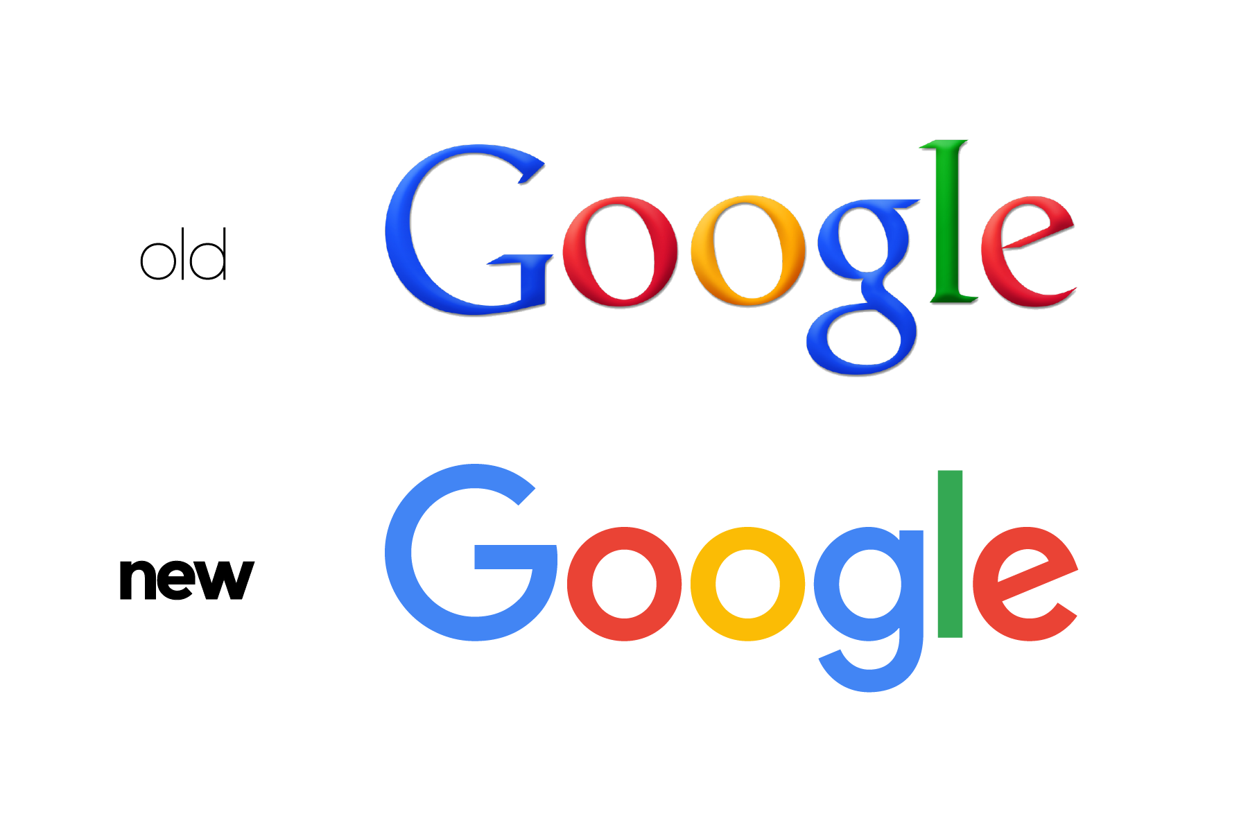
In this regard, Google’s new logo, unveiled yesterday, is no different. Typography nerds like myself debate the merits of moving from a serif to sans-serif typeface ad nauseam, the Twitterati complain about the crooked ‘e’, while the rest of the internet comes to terms with the new look of the closest thing it has to a front page (sorry Reddit). For my money, Google’s — along with Apple’s, Coca-Cola’s and perhaps a handful of car manufacturers’ — sits as one of the world’s most recognisable logos, and how could it not, given the contact that so many of us in the developed world have with the search engine every single day?
A change, however minor, to a wordmark as ubiquitous as Google’s is bound to ruffle feathers, but in a few months—if not weeks—the new, simpler, slightly-muted logo will be the status quo, and we’ll move on with our lives. This graphical adjustment though, is indicative of change at the world’s fifth-largest company far more profound than a new logo.
Just last month, the search giant’s co-founders Sergey Brin and Larry Page announced a major restructuring of Google into a new holding company, Alphabet Inc. Google will continue on as a wholly-owned subsidiary of Alphabet, but the restructuring will allow Brin and Page — as the new conglomerate’s President and CEO respectively — to maintain more flexible control of its more diverse divisions, such as telecoms provider Google Fiber, smart thermostat manufacturer Nest Labs, and research lab Google X, known for its so-called ‘moonshot’ projects like the self-driving car.
Replacing Page as the CEO of Google-proper will be Sundar Pichai, the company’s current Product Chief. Pichai has overseen many of Google’s product innovations and developments like Chrome, Drive, Maps and Gmail, and since October 2014, he has taken charge of Android, Ads and Search too. It seems the move to CEO in earnest will be more symbolic than substantive (it surely won’t hurt his wallet either); Pichai’s been running the show at Google for a while.
In his first Google I/O keynote fully in the driver’s seat, Pichai revealed much about the direction of the company’s products in the coming years, from furthering its presence on wearable devices and embracing the Internet of Things, to an increased emphasis on contextually-aware voice search and a further move into virtual reality.
Access to the internet is becoming more diverse, both in terms of geography and the devices we use it with. Google hasn’t been restricted to the desktop for a long time, but now the PC isn’t even its primary home, and its adapting to these new platforms.
This is reflected in the design philosophies of the new logo: its dynamically-animated nature allows it to morph to the varying contexts of search — with type, touch or voice; the loss of serifs makes the type more legible on any screen size — a desktop, smartphone, wristwatch or car dashboard; and its increased simplicity allows it to maintain fidelity on low-bandwidth connections, crucial in the developing world where Google is determined to help bring the internet to the next billion users.
Nothing is static — Google has been evolving constantly for the best part of two decades (as the above video elegantly illustrates), and so has the technology that increasingly shapes the world around it. This evokes the words of German philosopher Arthur Schopenhauer: “Change alone is eternal, perpetual, immortal.”
Sometimes it just takes a new logo to recognise it.
Oh, and… the ‘e’ was always crooked. ⬢
This article was published in PR Week.